
The Cinematography of “Fingerprints”
Originally published January 23, 2017
I’ve revised this article to refocus its message towards the intended target of discussing how the scene best served the story rather than how excluding coverage was beneficial.
Fingerprints is a short film that I shot and edited for director Bill Redding. The story is about a woman who desperately wants a child, and is attending classes to obtain her certificate to adopt, however, due to circumstances both internal and external, she may never have the chance.
What drew me to this story was how small it was in scope, but how big it could be with the right actors, and we got very lucky in Gail. It had been a minute since I last shot a narrative film project and it was exciting to be able to hop back in on material that was small and personal and I could really focus my attention on the importance of getting just the right shot and just the right light to help advance the story.
This film really pushed me to explore unique ways to light a scene, since I had a goal in mind of how this movie should look that required really big light, despite the fact that our toolkit only gave us a small handful of lights, with an 800w Joker HMI being our biggest light source, so we had to get creative.
I'll detail some of what I did to get the look I was going after below.
First, let's take a look at an early scene in the movie.

This scene plays out in a single camera move, which starts at the far back end of a 3 foot slider, and slowly, over the course of the entire scene, moves forward, finally getting into a more medium close-up shot. It's a subtle move that you hardly feel, but if you plan to play a scene out in a oner, I think having camera movement, subtle as it may be, is necessary. The audience will feel that movement, and they'll feel that that movement represents the forward momentum of the story, even if the movement is so small and subtle that you hardly notice it while watching the scene.
Even as the other character moves through the scene, we keep Gail at the center of the shot. The goal of this setup and coverage was to create a feeling that "this is her story." It's thanks to the immense talent of both Gail Rastorfer and Jeff Garretson that this scene can work in this way, using subtlety to share information rather than being obvious with the camera or coverage.
A side note about this scene, it originally appeared later in the script, and even during shooting we expected it would appear towards the end of the film. The scene that appears at the end of the film, Auntie writing in her notebook, was originally going to open the film. You can see how we intended to use a lot of traditional coverage and close-ups to setup the film, however in switching the scene order, we found that lingering on this long shot up front put the viewers focus more firmly on the Auntie character right up front, and still supported the direction the plot was heading.
Final note, an earlier version of this article incorrectly suggested that the role played by Jeff was unimportant. I wouldn't use that term, no person on a film set is unimportant, from the lockup PA to the caterer, to the guy who walks behind the bushes as a background extra, to the lead actor who has no lines in this scene. In this case, the role that Jeff plays was intentionally downplayed so that the camera could focus on Gail's character of Auntie, and so audiences watching the film wouldn't be given the opportunity to feel like there was a subplot brewing between the two characters. In this regard, and I recall this direction being given on set, Jeff did the best work of any actor out there in giving us a very real and living character who appears on screen only briefly.
But that's not without its challenges. First, lighting. Since there was some blocking that had to happen in the scene, we had to design a lighting setup that wouldn't have the other actor crossing and shadowing Gail as he moved around behind the set, or have the crew or the microphones shadowing the scene. All the while, we wanted a soft light that fell off into darkness pretty quickly, but that we could control
By this point we had already filmed so much of the film with a book light setup that we felt we had to continue that look to be consistent, so we designed a book light on the ceiling.
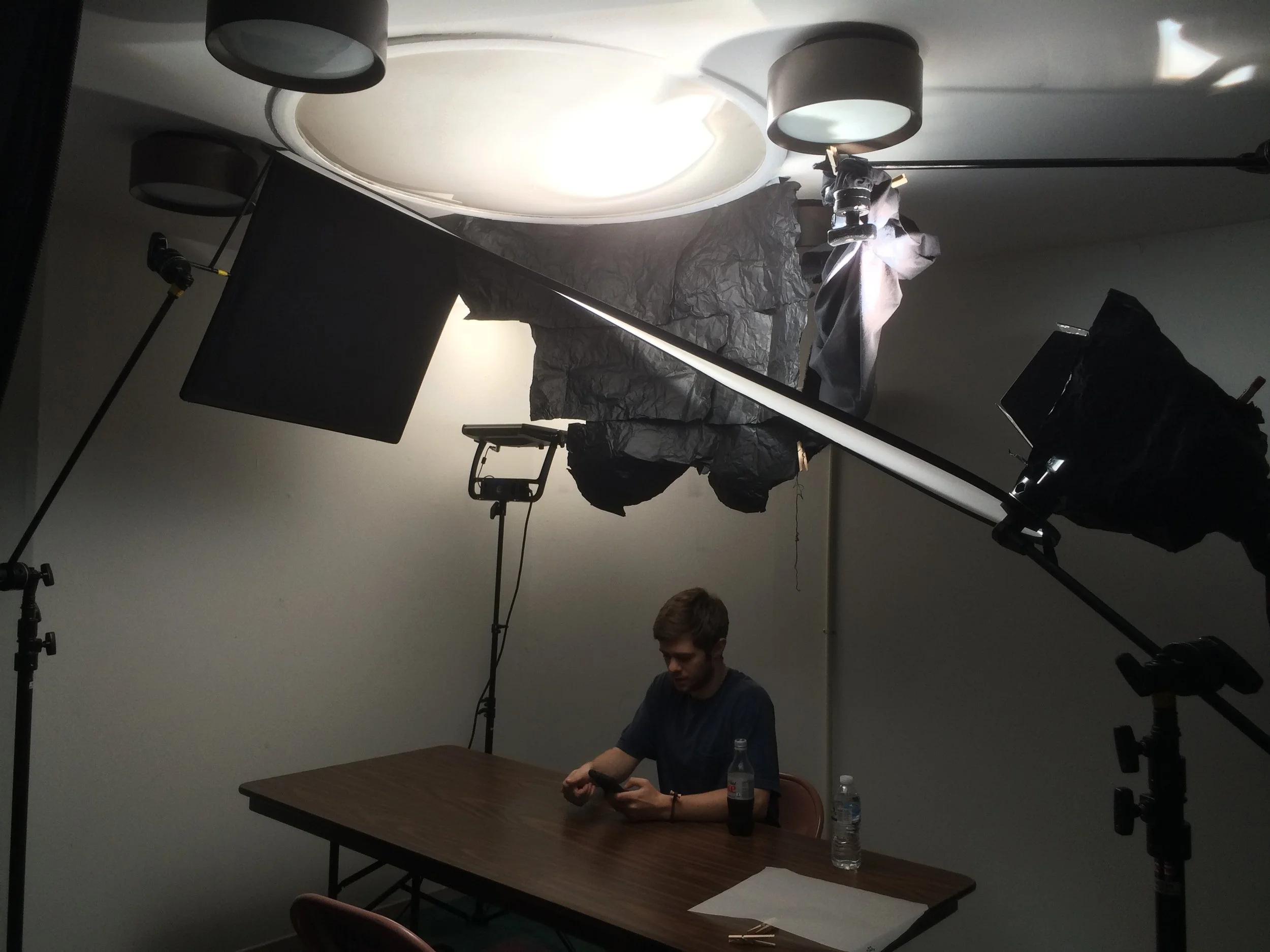
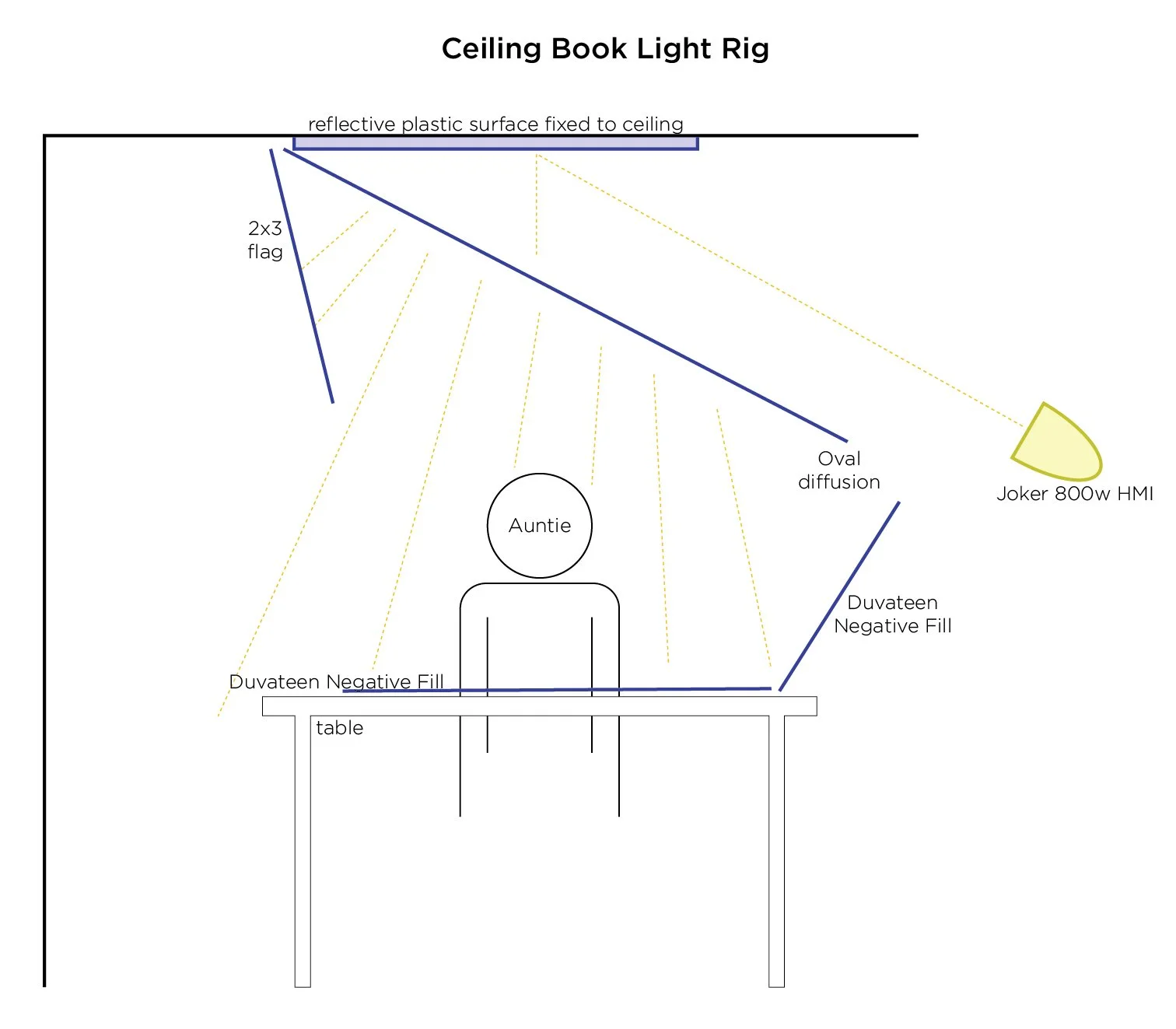
What's happening here is that we have an 800w HMI Joker shooting up into a plastic ceiling light that we found already installed at the location. It was powerful and reflected the light perfectly. Next we needed to book it, so we used a C-Stand to hold up an oval diffusion on an angle which diffused and pointed the light downwards softly.
This of course created a ton of spill on the walls, so we began controlling that spill. You can see that we used a huge chunk of black wrap, additional C-Stand, duvateen and a flag to control as much of the spill as we could. We wanted to keep the walls completely dark so that we could control how they were lit separate from Gail.
Once we had control over the walls, we sneakily placed an Astra 1x1 in the corner, and bounced it off the ceiling. This created a very gentle soft light on the back wall. Here is a diagram that shows how this setup worked:
Despite being the last thing we filmed, this is the first scene in the movie, and it really sets the tone for what to expect visually from the rest of the film.
We had to get really scrappy with our location options, so this scene was filmed in the same room as a scene that appears later in the film where Auntie visits a classroom. We used the same walls, and through lighting, color correction and camera angles we completely transformed the room into something else.
While lighting gets you pretty far, you can't take it all the way without color correction.
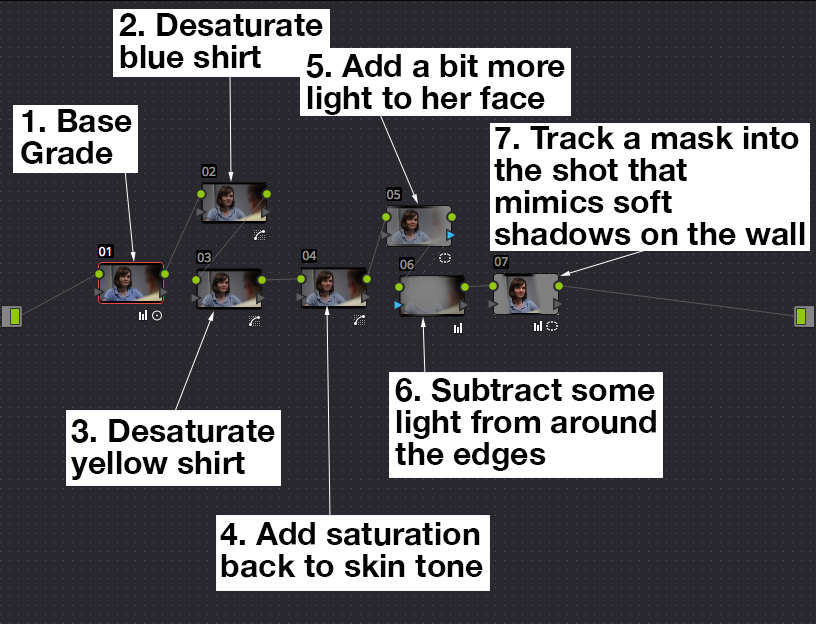
It looks confusing at first, I'm using a lot of nodes in DaVinci Resolve, so I'm going to break it down a bit for you
First we apply a base grade, and once we have things looking brighter and more saturated and less like the original image from the camera, which tends to be very flat and colorless, we can start manipulating things.
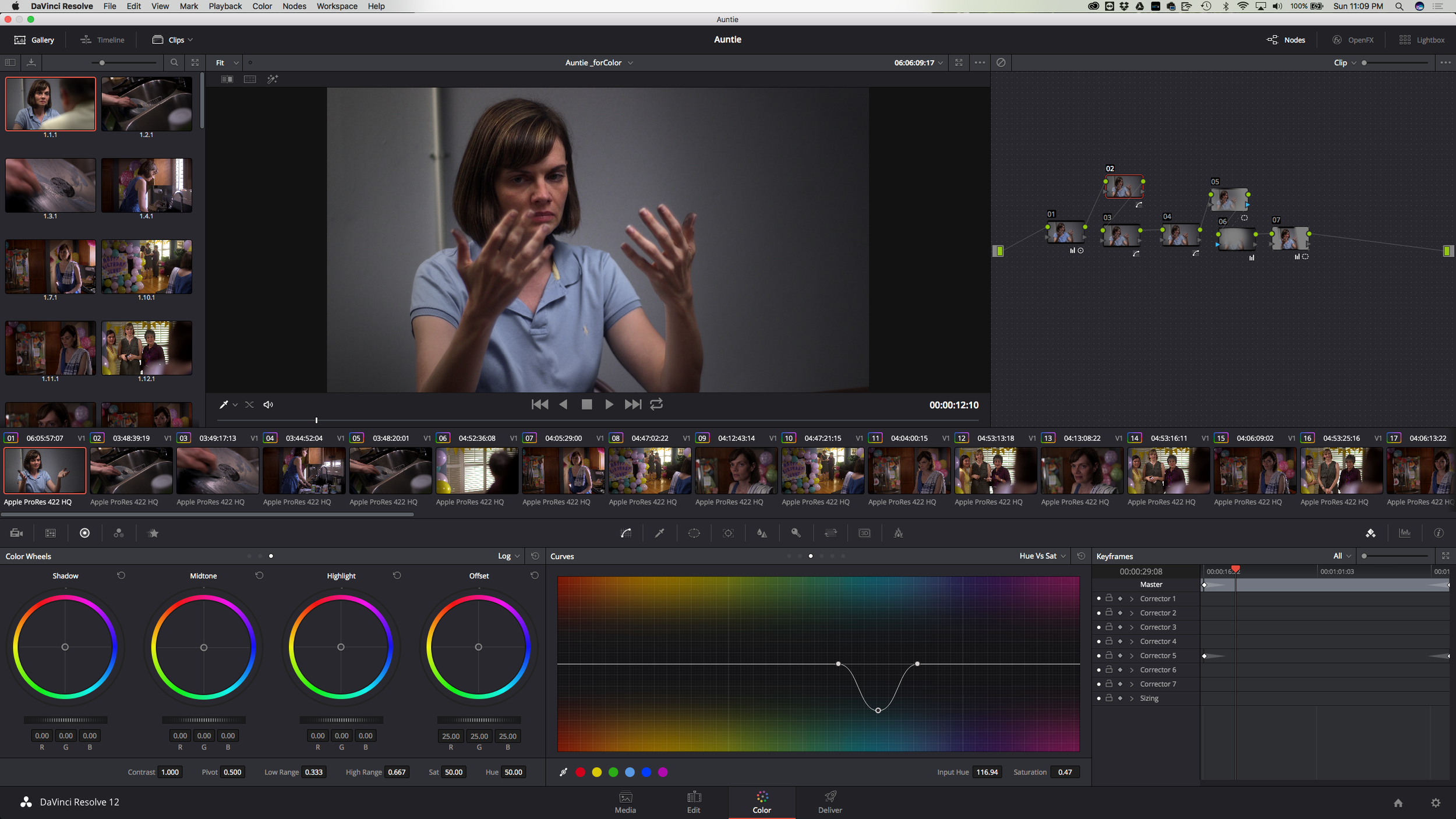
Here I am using the Hue vs. Sat curve to just attack the color of her shirt. The director had wanted to use colors to help express some of the ways the characters were feeling, and it was a great idea, however we had clothing that was very loud compared to the rest of the scenes, and so a part of the color correction went towards working on finding the right subtle balance of how saturated that shirt should be.
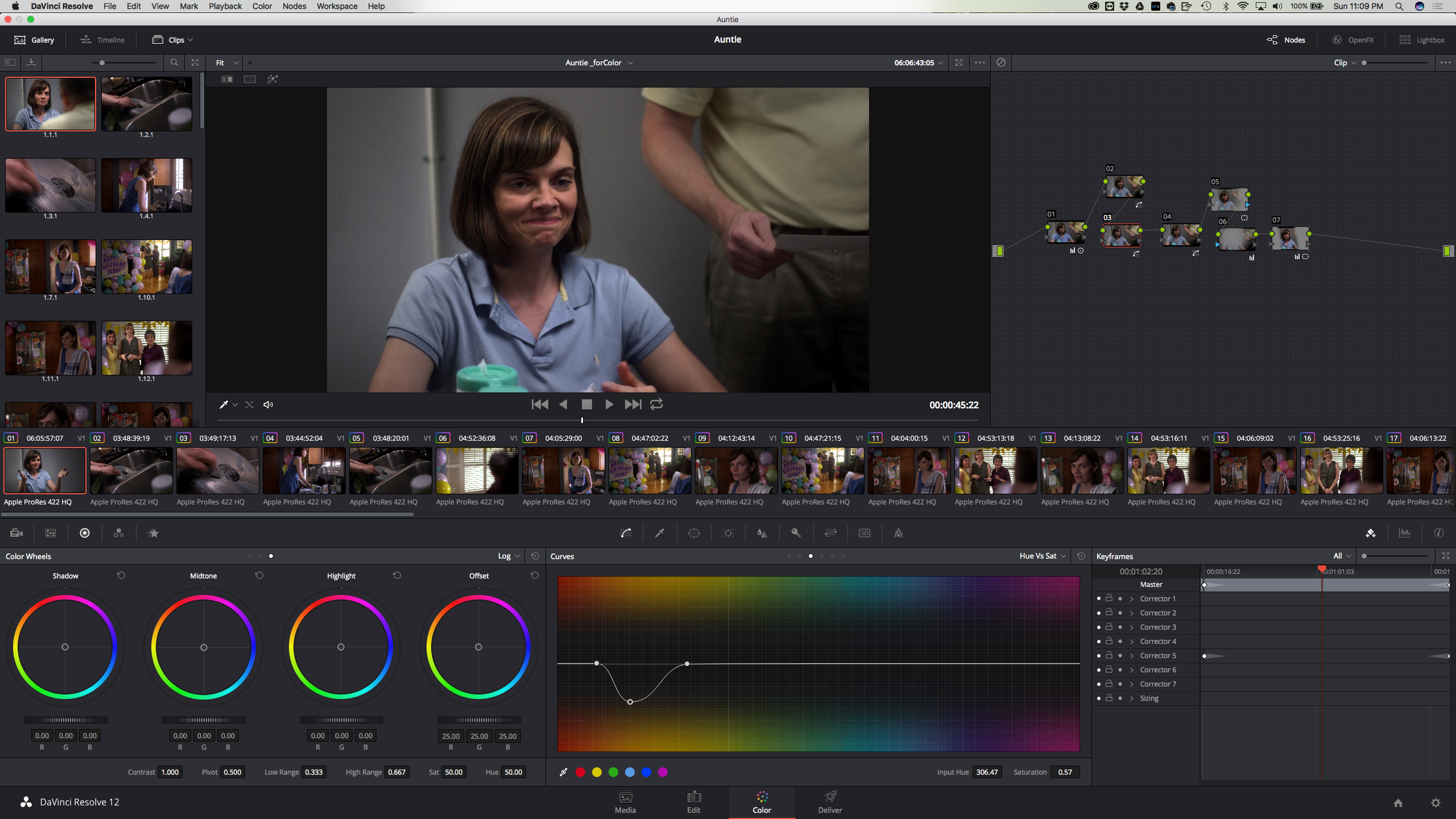
The same went for the yellow shirt.
Once I had that taken care of, I was able to push some life back into the skin tones, which had gotten a bit desaturated as a result of trying to push away some yellow from the shirt.
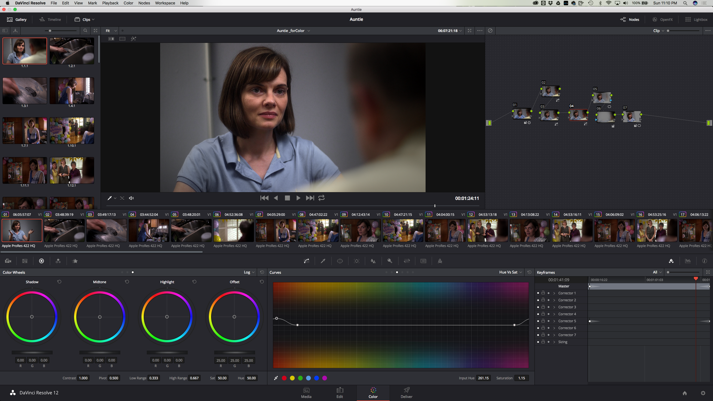
It was then time to shape the scene a little bit.
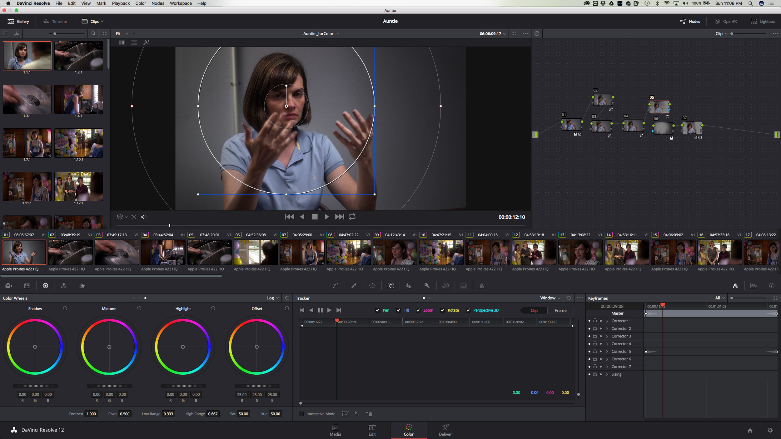
This power window serves two purposes. The first is to highlight her face a bit, and really draw your eye her direction. It's very subtle, in fact you can't quite tell what it's doing when you see the final image. What I've done is made a large circle mask around her face, and then took the feathering out really far, almost to the edge of the screen, this way the viewer won't ever be able to pinpoint why their eye is gradually going towards her face.
Then I make an Outside Node, and I very gently lower the Offset of that node, making the edges just slightly darker than the center.
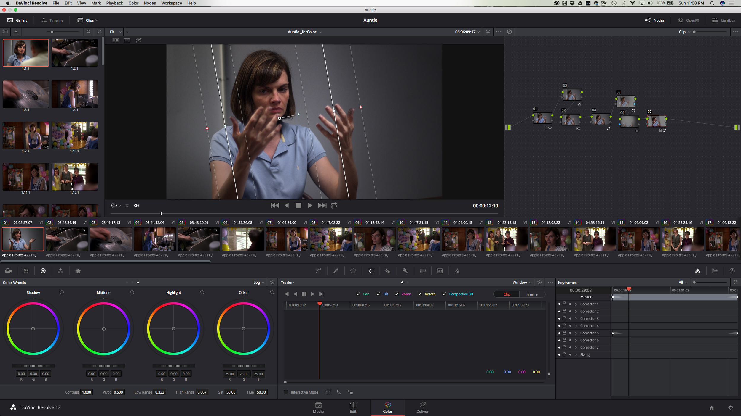
In my final node, I designed a Square Power Window and tracked it into the shot using the built in tracker. This window is designed to recreate some of the rays of light that are naturally present in the scene, making it appear that there's a more specific ray of light right above where she is sitting, and reinforcing some of the shadows that belong on the wall behind her. Again, it's subtle, you shouldn't be seeing a cut or a line right there, rather it should feel like this is just right based on the shot and what the light says is going on in the shot.
Keeping the Same Light
I knew we had to keep things consistent to keep the tone and mood of the film working the whole way through. Another scene that presented a challenge was a large scene with many extras, and several shots that were going to be pretty wide, in a room with low ceilings.
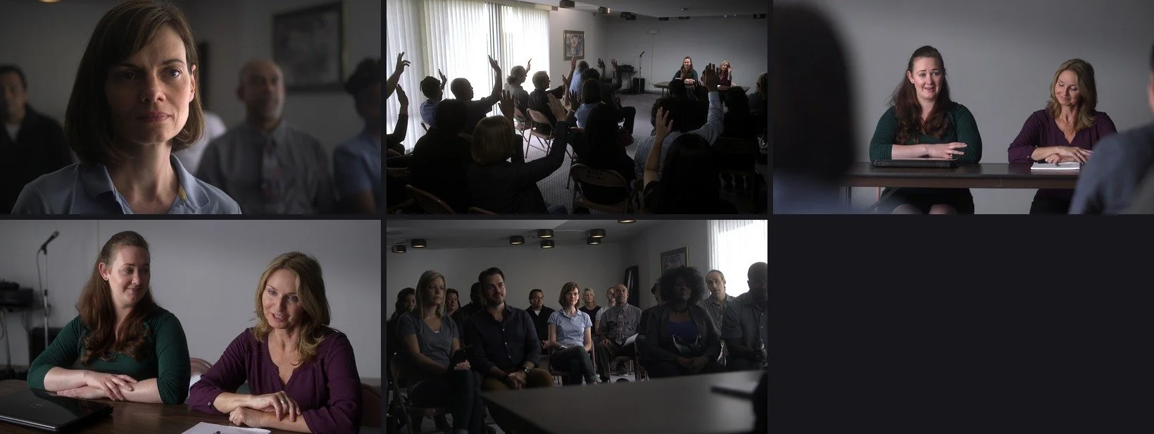
The challenge, as with all movies, is consistency. This room was especially difficult to keep consistent because our main source in the room was the sunlight coming in from the large windows on the left side. We closed the curtains and lined the windows with diffusion to make one large soft source. This worked wonders on closeups:
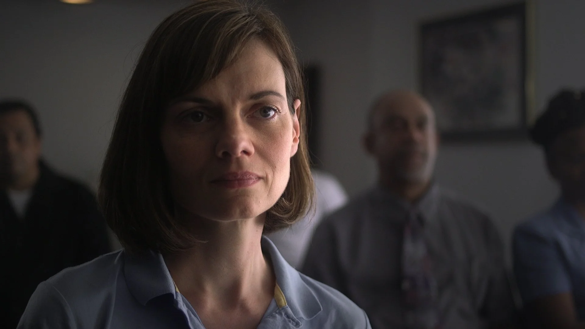
But not so well in wide shots.
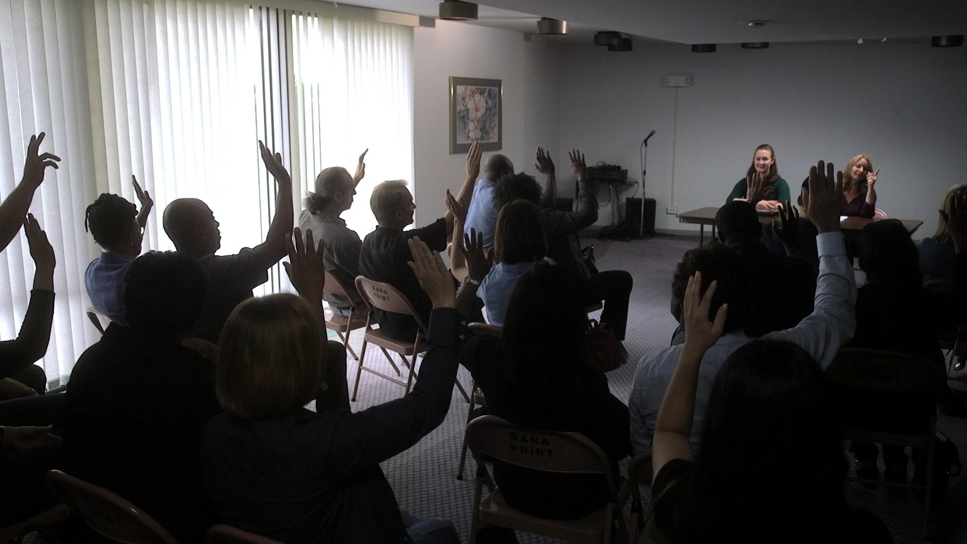
This was the trickiest shot of the day. Not only did we not have the right lighting package, but there was really nowhere that I could put lights in the room that would throw the light on the actresses at the table without being in the shot.
For a moment we discussed splitting the frame and doing some VFX composite work, however there was too much movement of the extras throughout the scene that it would have made that composite work overly complex.
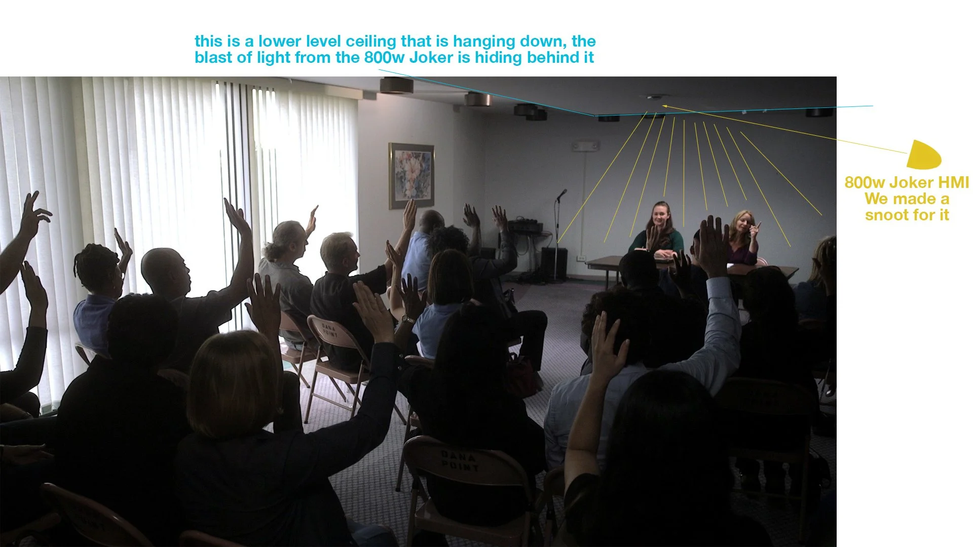
Instead, my gaffer and I came up with the idea of pushing light into the ceiling beyond the actresses, but behind the lower level ceiling visible in the shot. This allowed us to bounce light back onto them in a convincing enough way that it could read as part of the light already in the room.
If you can't tell, Il show you where the light is coming from:
Final Insights
I think it's important to constantly try to improve your work. One of the things I have been bad about in the past has been lighting and color correction, while I understand it, I don't think that I really get how to do it, I'm still learning, and probably will be forever.
But this film shoot gave me a confidence in those areas that has been great, I wanted to focus more specifically on lighting and less on designing complex camerawork, and the result paid off. I wanted to better myself as a colorist, so I made sure that I handled the post production color correction, and I'm glad I did because I learned a lot about the process.
I think it's important to always be going just one step beyond your boundaries and try new things, you may not always be able to pull off exactly what you imagined, but you get better by trying. Use what you learn and make the best work you can. Remember to make choices that support the stories you are telling, and make sure you are being a collaborative team player with your director and post production team.
Good luck fellow filmmakers!